
Accessibility is no longer a side topic for websites and apps. It affects user experience, conversion, brand trust and, depending on the service, legal requirements. In Germany, the Barrierefreiheitsstärkungsgesetz, or BFSG, has made many companies ask the same question: does our website or app need to be accessible, and what does that mean technically?
This article is not legal advice. It explains how companies can approach the topic pragmatically and professionally: with a technical audit, clear WCAG criteria, clean implementation and ongoing quality assurance.
What is the BFSG?
The BFSG implements requirements from the European Accessibility Act in Germany. It aims to make certain products and services accessible. For digital teams, this is especially relevant where services are provided through websites or apps, for example certain e-commerce, banking, telecom or booking services.
Important: not every company website is automatically affected in the same way. The exact assessment depends on the offer, company size, service and individual case. Still, treating accessibility only as a legal checkbox is risky. Many improvements help all users: clearer forms, better keyboard support, readable contrast, understandable errors and stable layouts.
What does WCAG have to do with the BFSG?
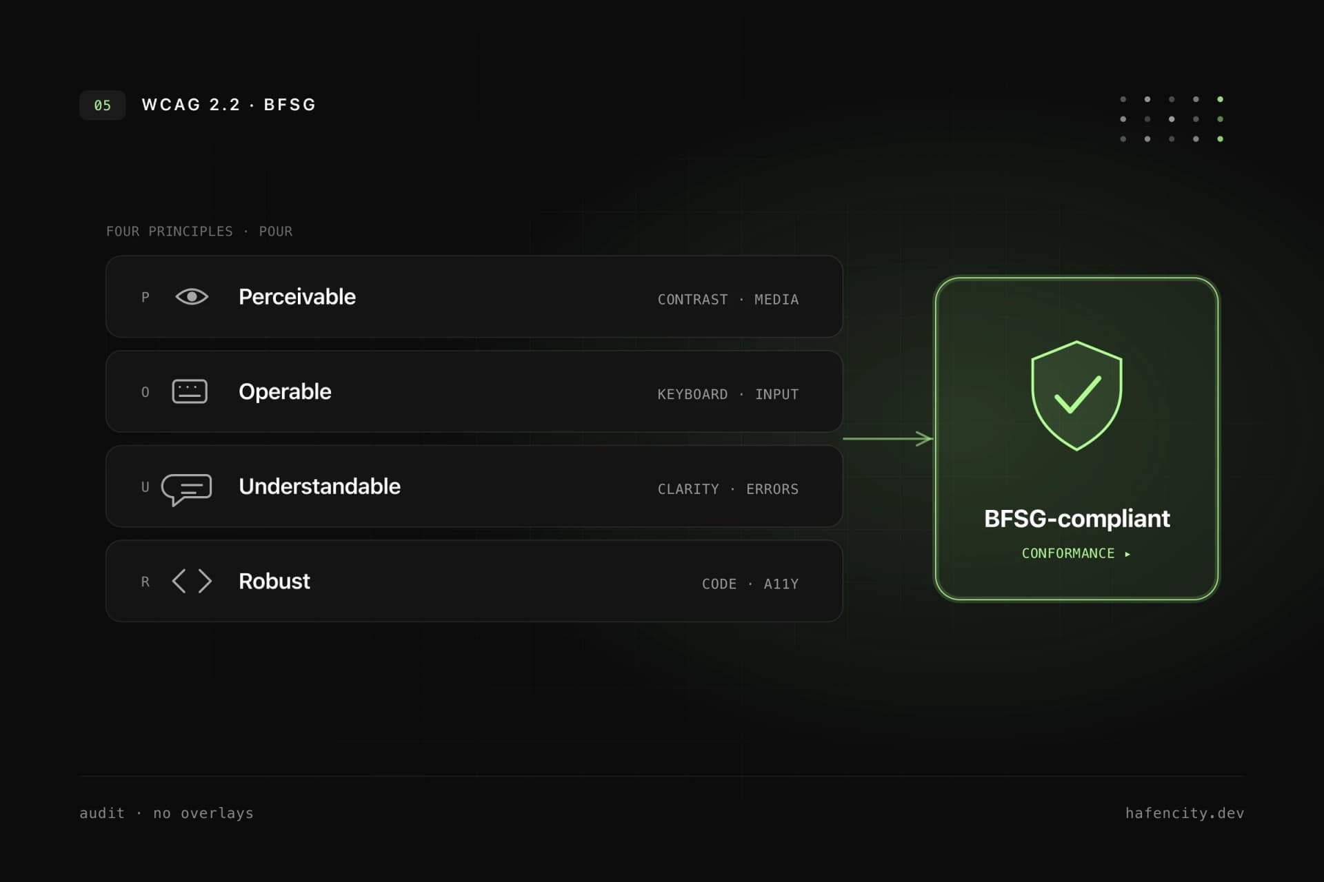
The Web Content Accessibility Guidelines, or WCAG, are the international technical standard for accessible web content. The W3C Web Accessibility Initiative describes WCAG as a standard for web content, including text, images, structure, code and interaction. WCAG 2.2 has been available as a W3C Recommendation since October 2023 and has since been updated.
WCAG is based on four principles:
- Perceivable: content must be visible, audible or otherwise understandable.
- Operable: users must be able to operate the interface by keyboard, touch, mouse or assistive technology.
- Understandable: content and interactions must be clear.
- Robust: code must work with different browsers, devices and assistive technologies.
For companies, WCAG is the most useful technical reference framework, even if the legal assessment must still be handled separately.
Why accessibility overlays are not enough
Many vendors promise accessibility through a script or overlay. That sounds convenient, but it rarely solves the actual problems. An overlay cannot fix a semantically broken HTML structure, replace poor keyboard navigation or turn confusing form errors into good UX.
Accessibility is built into the product itself:
- information architecture
- design system
- components
- content
- forms
- keyboard and screen reader testing
- ongoing maintenance
An overlay can at most be an addition. It should never replace proper implementation.
The most important technical measures
Semantic HTML
Screen readers and other assistive technologies rely on structure. Headings, lists, buttons, links, forms and regions should be marked up correctly. A clickable div is not a button. A button that navigates may often need to be a link.
Keyboard support
Every important function must be reachable without a mouse. Focus states must stay visible. Modal dialogs need focus management. Menus, dropdowns and sliders must be usable by keyboard.
Contrast and readability
Text, icons and UI states need sufficient contrast. This applies not only to body text, but also to placeholders, error messages, disabled states and focus indicators. Font sizes, line heights and spacing must work on mobile devices.
Forms
Forms are one of the most common problem areas. Every field needs a label. Error messages must be understandable and associated with the field. Required fields should be recognizable. Success messages should be announced to screen readers.
Alternative text
Images need meaningful alt text when they carry information. Purely decorative images should be hidden from assistive technologies. Product images, diagrams or screenshots need context.
Motion and animation
Animations can help orientation, but they can also create problems. Reduced motion preferences should be respected. Critical information must never be conveyed only through motion.
Performance and stability
Accessibility and performance are connected. Slow, shifting interfaces are frustrating for everyone and especially difficult for some users. Stable layouts, fast interactions and clear loading states improve accessibility.
BFSG checklist for websites and apps
This checklist does not replace a full audit, but it helps with a first review:
- Can all pages be used by keyboard?
- Is focus visible and logical?
- Is the heading structure clean?
- Are buttons and links semantically correct?
- Do form fields have labels and understandable errors?
- Are status messages announced to screen readers?
- Is contrast sufficient?
- Do relevant images have alt text?
- Do navigation and forms work on mobile?
- Are PDFs or embedded documents accessible?
- Is there a process for new content and components?
- Have keyboard and screen reader tests been performed?
If several points are unclear, an accessibility audit is worth doing.
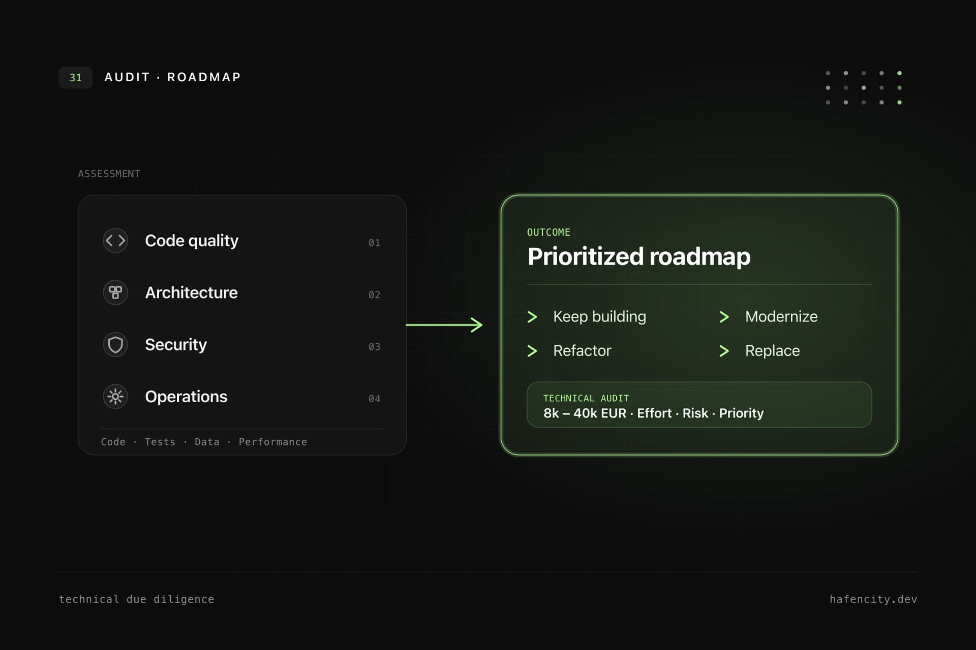
How a professional accessibility audit works
A good audit is not just an automated tool report. Tools find many technical issues, but not all. They can detect missing labels, some contrast issues or ARIA errors. They cannot reliably determine whether a user journey is logical, whether language is understandable or whether a complex workflow really works with a screen reader.
A professional process includes:
- Page selection: key templates, forms, checkout or booking flows.
- Automated analysis: quick detection of recurring technical issues.
- Manual review: keyboard, screen reader, focus order and semantics.
- Prioritization: blockers first, cosmetic details later.
- Implementation: fix components, design system and content.
- Regression tests: make sure problems do not return.
- Documentation: clear actions and remaining risks.
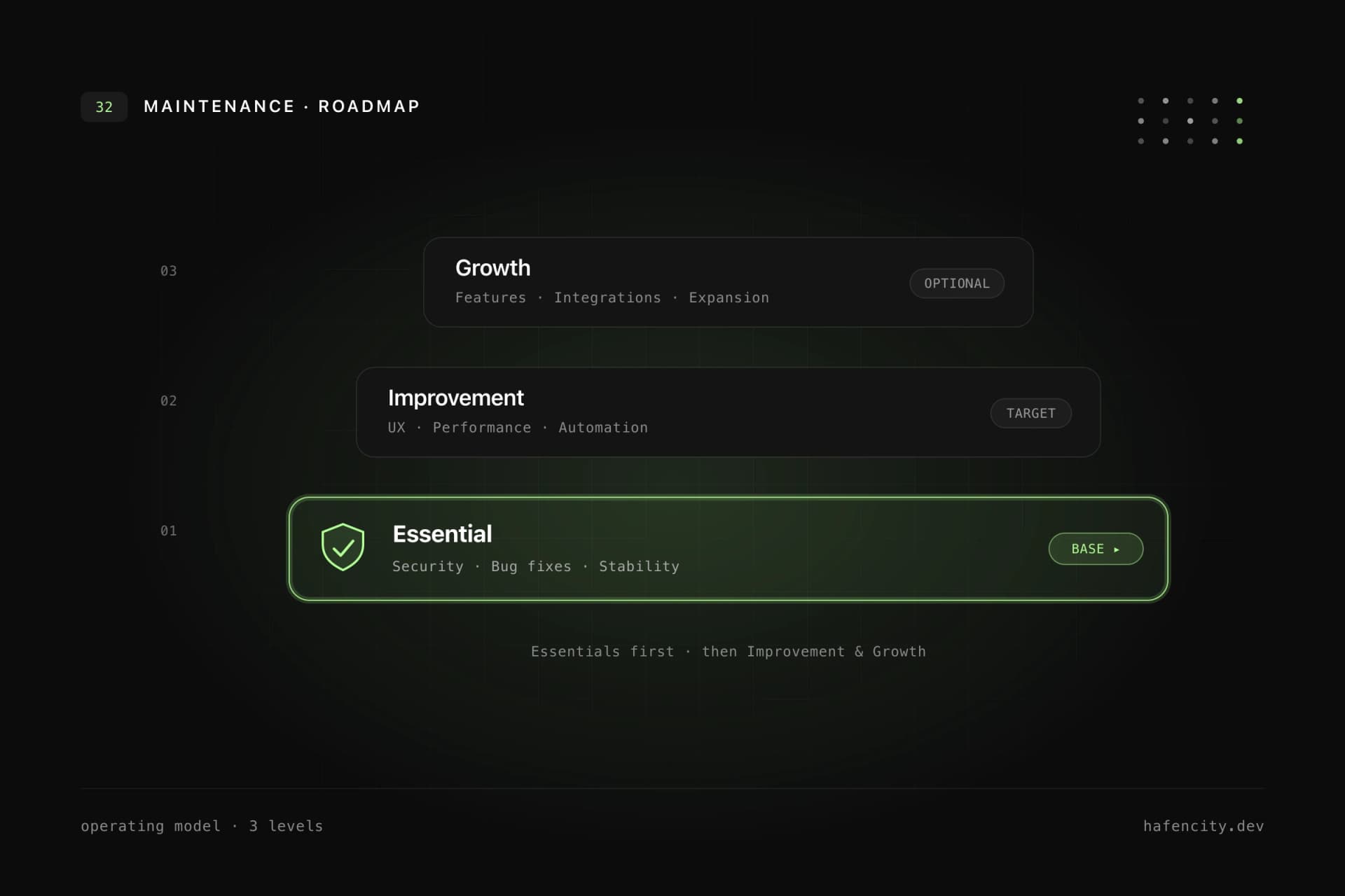
Build accessibility into the design system
If a company operates several websites, apps or portals, accessibility should not be solved separately for every page. It belongs in the design system: buttons, inputs, modals, navigation, tabs, tooltips and tables need accessible patterns and documentation.
This saves effort over time. Every new feature benefits from tested components. Accessibility becomes a default, not rework.
Common mistakes
The first mistake is checking accessibility only shortly before launch. By then, fundamental decisions are already made and fixes are expensive.
The second mistake is testing only the homepage. The critical parts are usually forms, logins, booking flows, tables, filters and dynamic app areas.
The third mistake is treating accessibility as purely technical. Content, language, error messages and product logic matter as much as ARIA attributes.
Who should act now?
An audit is especially useful if:
- your website generates leads or revenue.
- your app is important for customers, patients, applicants or members.
- you offer e-commerce, booking, login or digital services.
- you are planning a new design system.
- you are already preparing a relaunch.
- you want to clarify BFSG risks early.
Even if your company is not directly affected, accessibility improves product quality. Better forms, clearer structures and more robust components support conversion, reduce support effort and build trust.
How hafencity.dev helps
We combine UX/UI design, design systems and technical accessibility. That means accessibility does not remain stuck in an audit document. It becomes part of components, pages, forms and workflows.
If you want to understand where your website or app stands, we start with a compact audit and a prioritized action list. Your team can then implement the fixes itself, or we can handle the technical corrections.