
Many companies now understand that accessibility matters for websites and apps. The harder question is practical: what should product, design, content and engineering teams actually implement now?
This article complements our BFSG checklist. That article focuses more on context, audits and first review points. This one focuses on the product work: which requirements should become part of components, forms, content, design systems and release processes.
Important: this article is not legal advice. Whether and to what extent a website, app or digital service is legally required to be accessible depends on the specific offer, the company and the individual case. Companies should get legal advice where legal assessment is needed, especially regarding the German Barrierefreiheitsstärkungsgesetz (BFSG).
Use WCAG as the technical working standard
The Web Content Accessibility Guidelines (WCAG) from the W3C Web Accessibility Initiative are the central technical reference for accessible web content. For websites, web apps and many hybrid app interfaces, they are useful even when the legal assessment is handled separately.
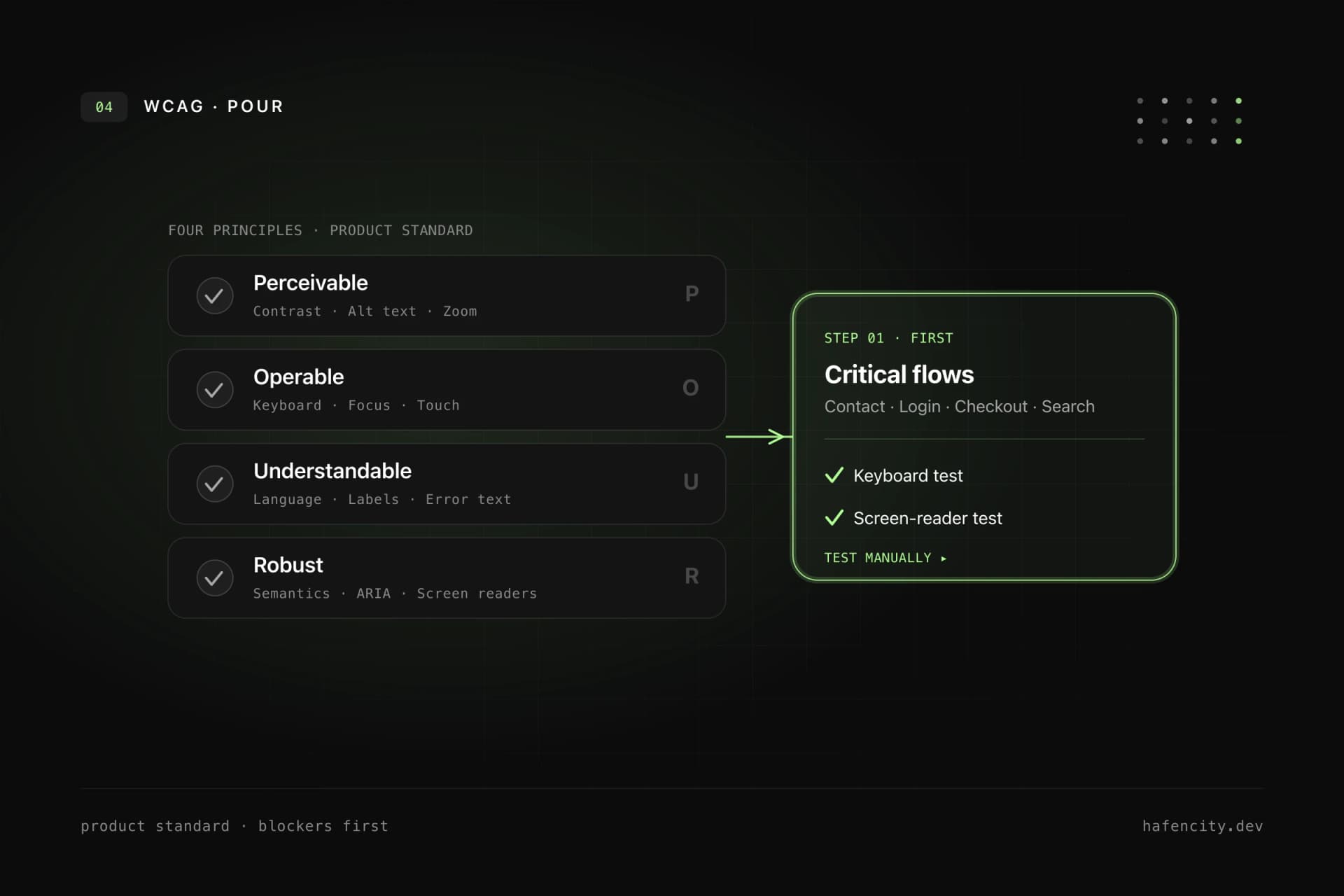
In practice, companies should not treat WCAG only as an audit document. They should treat it as a product standard. Every new component, form and important user flow should be checked against the four WCAG principles:
- Perceivable: Content must remain understandable without perfect vision, color perception or audio.
- Operable: Functions must work with keyboard, touch, mouse and assistive technologies.
- Understandable: Language, navigation, errors and interactions must stay clear.
- Robust: Markup and states must work with browsers, screen readers and other assistive technologies.
A good internal standard is this: new UI is not done until keyboard support, focus, contrast, semantics, form behavior and understandable content have been checked.
Take keyboard support seriously first
Keyboard support is one of the fastest ways to expose real accessibility problems. If a dialog, menu, filter, calendar, slider or checkout step does not work without a mouse, the interface blocks many users.
Companies should make at least these rules mandatory for every website and app:
- All interactive elements are reachable by keyboard.
- The focus order follows the visual and logical structure.
- Focus is always clearly visible.
- Modal dialogs keep focus inside the dialog and return it meaningfully when closed.
- Menus, tabs, accordions, autocomplete fields and dropdowns have expected keyboard behavior.
- There are no keyboard traps that users cannot leave.
This is not a specialist topic for the final QA slot. Designers must design focus states. Developers must use semantic elements and correct focus management. Testers must run key flows using only the keyboard.
Make focus states visible and robust
Focus is navigation. Removing focus removes orientation.
A common mistake is outline: none without an equivalent replacement. Another is a focus ring that technically exists but is barely visible because of weak contrast, clipped containers or animations.
Good focus states are:
- clearly visible on light and dark backgrounds
- not communicated only through color
- consistent across buttons, links, inputs, cards and complex widgets
- not clipped by
overflow: hidden - documented in the design system
For apps and complex web products, it is also worth running a dedicated focus review for modals, toasts, tab navigation, sidebars, tables, drag-and-drop alternatives and multi-step workflows.
Build accessible forms
Forms often decide revenue, leads, bookings, applications or support cases. They are also one of the most common accessibility risk areas.
Every form should meet these baseline requirements:
- Every input has a visible, programmatically associated label.
- Required fields are clearly identifiable.
- Help text is associated with the field.
- Error messages explain the problem and, where possible, the solution.
- Errors are not communicated through color alone.
- After submission, users move logically to the error or summary.
- Success messages and status changes are announced to screen readers.
- Autocomplete, input types and mobile keyboards are configured sensibly.
Multi-step forms, checkout processes, login, password reset, file uploads, date fields and dynamic validation are especially critical. These flows should always be tested manually with keyboard and screen reader.
Check contrast, typography and visual states
Contrast is not only about body text. Companies should also check icons, placeholders, labels, error messages, status badges, charts, focus rings, disabled states and hover states.
Good visual accessibility starts in design:
- Font sizes and line heights work on mobile viewports.
- Text stays readable when users zoom or increase font size.
- Color is not the only signal for status, error or selection.
- Interactive targets are large enough and have enough spacing.
- Content over images or videos remains reliably readable.
- Animations respect reduced motion preferences.
If a design system uses color tokens, the allowed combinations should be documented. A button token alone is not enough. Teams need clear rules for which text, background, border, focus and status colors work accessibly together.
Make content understandable
Accessibility is not only code. Unclear copy can exclude users just as much as missing labels.
For content teams and product owners, these points matter:
- Headings describe the content of the following section.
- Link text is understandable without relying on the surrounding sentence.
- Buttons name the action clearly.
- Error messages explain what to do.
- Alternative text describes relevant image content, not decorative mood.
- Tables have clear headers and are not used for layout.
- Complex information is structured instead of hidden in long text blocks.
SEO and accessibility often point in the same direction here. Clear headings, specific link text and understandable page titles help users, screen readers and search engines.
Prefer semantics before ARIA
ARIA can help when native HTML elements are not enough. It can also break a lot when used incorrectly.
The robust baseline rule is: semantic HTML first, ARIA only where it is really needed. A real button already brings keyboard behavior and role. A correct label is better than an improvised label added later. A clean heading structure is more reliable than visual text sizes without meaning.
Companies should therefore watch for these patterns in code reviews:
- No clickable
divorspanelements for real actions. - Links navigate, buttons perform actions.
- Headings are chosen by structure, not by visual size.
- Landmark regions such as
main,nav,headerandfooterare used sensibly. - ARIA attributes are tested, not just added.
Build accessibility into the design system
If accessibility is solved page by page, it stays expensive and error-prone. For companies with several websites, apps, portals or campaigns, accessibility belongs in the design system.
The design system should document the following for core components:
- keyboard behavior
- focus states
- allowed color and contrast combinations
- screen reader names and state announcements
- error patterns and validation logic
- responsive behavior
- content do's and don'ts for variants
The technical implementation matters as much as the documentation. A design system only works when buttons, inputs, dialogs, tabs, tables, navigation and notifications are available as tested components and are actually used by product teams.
Automate tests, but decide manually
Automated tools are important. They quickly find missing labels, some contrast issues, invalid ARIA attributes and structural problems. They do not replace manual review.
A useful test mix looks like this:
- Linting and component tests during development.
- Automated accessibility checks in CI for central pages and components.
- Manual keyboard testing for critical flows.
- Screen reader testing with realistic tasks.
- Browser and device checks for responsive layouts.
- Regression tests after changes to the design system, navigation and forms.
For web teams, tools such as axe, Lighthouse or Playwright-based checks are useful. But the decision whether a flow is truly understandable and operable remains a manual quality question.
Organization: clarify ownership
Accessibility rarely fails because of one missing attribute. It often fails because nobody owns it in the process.
Companies should therefore anchor accessibility organizationally:
- Product management prioritizes accessibility requirements in roadmaps.
- Design defines accessible states and components.
- Engineering implements semantics, keyboard behavior and tests.
- Content maintains clear language, alternative text and structure.
- QA checks keyboard, screen reader behavior and regressions.
- Legal or compliance clarifies regulatory classification with external advice where needed.
In practice, this works best with a prioritized action list: blockers first, then recurring components, then templates and content migration. That creates progress without turning accessibility into an overwhelming all-at-once project.
What companies should prioritize now
If you do not know where to start, this sequence is pragmatic:
- Identify critical user flows: contact, inquiry, purchase, booking, login, search, application.
- Test those flows with keyboard and screen reader.
- Fix form labels, error messages, focus and contrast.
- Repair recurring components in the design system.
- Improve content structure, link text, alternative text and page titles.
- Add automated checks in development and CI.
- Add accessibility as an acceptance criterion for new features.
The goal is not to tick off a document once. The goal is a product process where new barriers are less likely to be created in the first place.
Legal context: careful, not panicked
In Germany, the BFSG implements requirements from the European Accessibility Act. The German Federal Government describes the law as a framework for more accessibility in certain products and services. Depending on the business model, digital services provided through websites and apps can be relevant.
Still, not every website is affected in the same way, and the exact obligation depends on the individual case. Companies should not derive the legal classification from blog posts. They should clarify it with qualified legal advice where needed.
Technically, however, the direction is clear: companies that build websites and apps around WCAG principles, a clean design system and reliable tests reduce risk while improving product quality.