
Accessibility is no longer a niche topic. According to the WebAIM Million report 2026, 95.9% of the one million most-visited home pages had detected WCAG failures — on average 56.1 per page, up roughly 10% on the year before. At the same time, the EU legal picture has become concrete: since 28 June 2025, Germany's Barrierefreiheitsstärkungsgesetz (BFSG) is in force, transposing the European Accessibility Act.
So the harder question is no longer "whether" but "what exactly". This article complements our BFSG checklist: that one covers context, audits and first review points. This one is about the product work — which requirements should land in components, forms, content, design systems and release processes.
Important: this article is not legal advice. Whether and to what extent an offering is legally required to be accessible depends on the individual case. For legal assessment — especially regarding the BFSG — companies should seek qualified advice.
WCAG 2.2 is the technical working standard
The Web Content Accessibility Guidelines 2.2 are the authoritative technical reference in 2026 — not WCAG 3.0. WCAG 2.2 has been a W3C Recommendation since 5 October 2023 and adds nine new success criteria over 2.1, for example on focus visibility and target sizes. WCAG 3.0, by contrast, exists only as a working draft (last updated March 2026) and is unlikely to become a recommendation before the end of the decade — so teams should keep aligning their work with 2.2.
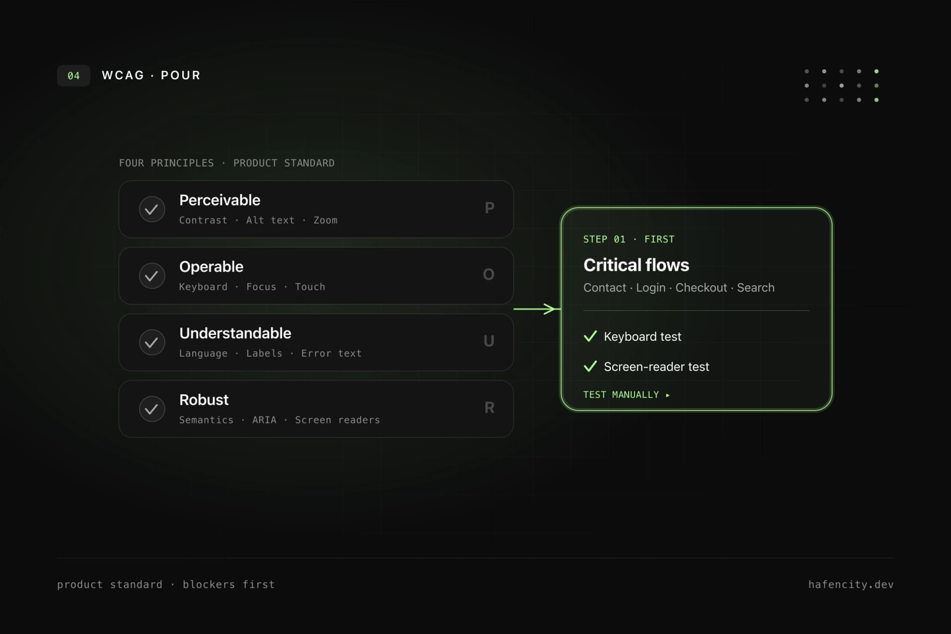
WCAG is also the regulatory anchor: the European standard EN 301 549, which the BFSG and EAA build on, references WCAG 2.1 Level A and AA in its current harmonised version; an update to 2.2 is in preparation. In practice this means WCAG is not an audit document for the end — it is a product standard. Every new component and every important flow should be checked against the four principles.
| WCAG principle | Meaning | Typical check |
|---|---|---|
| Perceivable | Understandable without perfect vision, color or audio | Contrast, alt text, captions |
| Operable | Usable with keyboard, touch, mouse, assistive tech | Keyboard path, focus, target size |
| Understandable | Language, navigation, errors stay clear | Labels, error text, plain language |
| Robust | Markup and states work with screen readers | Semantics, ARIA states, tests |
Most barriers come from five places
Accessibility rarely fails on exotic edge cases — it fails on a handful of recurring errors. The WebAIM Million analysis shows this year after year: six error categories account for about 96% of all detected issues. Clearing them systematically removes the bulk of measurable barriers — and these are exactly the failures that are reproducibly fixable in code.
The good news: these errors have clear owners and clear fixes. It is not a special project — it is discipline in design, code and content.
| Common error | Share of pages | Fix | Owner |
|---|---|---|---|
| Low contrast text | 83.9% | Contrast tokens, documented color pairings | Design |
| Missing alt text | 53.1% | Required field for meaningful images, empty alt for decoration | Content |
| Missing form labels | 51% | Visible, programmatically associated labels | Engineering |
| Empty links | 46.3% | Descriptive link text instead of bare icons | Content/Engineering |
| Empty buttons | 30.6% | An accessible name for every button | Engineering |
Keyboard, focus and forms first
Keyboard support is the fastest way to expose real problems. If a dialog, menu, filter, slider or checkout step does not work without a mouse, the interface blocks many users. So make it binding: every interactive element is reachable by keyboard, the focus order follows the logical structure, focus is always clearly visible, modal dialogs trap focus and return it on close — and there are no keyboard traps.
Focus is navigation: removing it removes orientation. The classic outline: none without an equivalent replacement should be banned. Good focus states are clearly visible on light and dark backgrounds, not communicated through color alone, and not clipped by overflow: hidden.
Forms deserve particular care because they decide revenue, leads, bookings and applications. Every input needs a visible, programmatically associated label; required fields are clearly identifiable; error messages name the problem and the solution and are not communicated through color alone; success and status changes are announced to screen readers. Multi-step forms, checkout, login and file uploads should always be tested manually with keyboard and screen reader.
Contrast and understandable content
Contrast is about more than body text. Icons, placeholders, labels, error messages, status badges, focus rings, disabled and hover states all need checking. Good visual accessibility starts in design: text stays readable when zoomed, color is never the only signal for status or error, interactive targets are large enough, and animations respect reduced-motion preferences. If a design system uses color tokens, the allowed combinations must be documented — a button token alone is not enough.
Accessibility is also not only code. Unclear copy excludes users as much as missing labels does. Headings describe the section that follows, link text is understandable without the surrounding sentence, buttons name the action clearly, and alt text describes meaningful image content rather than decorative mood. SEO and accessibility pull in the same direction here — clear structure helps users, screen readers and search engines alike, as we show in Quality is measurable.
Accessibility belongs in the design system and in CI
If accessibility is solved page by page, it stays expensive and error-prone. For companies with several websites, apps or portals it belongs in the design system. There, core components should document keyboard behavior, focus states, allowed contrast pairings, screen reader names, error patterns and responsive behavior. The technical implementation is decisive: buttons, inputs, dialogs, tabs, tables and navigation must exist as tested components and actually be used.
For testing the rule is: automate checks, decide manually. Tools such as axe, Lighthouse or Playwright-based checks quickly find missing labels, many contrast issues and invalid ARIA attributes and belong in CI — but cover only a portion of the relevant criteria. Combined with manual keyboard tests, screen reader tests using realistic tasks and regression tests after design-system changes, you get a reliable mix. For ARIA the baseline rule holds: semantic HTML first, ARIA only where genuinely needed — a real button already brings role and keyboard behavior.
Order of work: what first, what later
Accessibility rarely fails on one missing attribute — it fails because nobody owns it. So it needs clear ownership — product management prioritizes, design defines states, engineering implements semantics and tests, content maintains language and structure, QA checks keyboard and screen reader — and a pragmatic order instead of one overwhelming all-at-once project.
Concretely: identify the critical user flows (purchase, login, contact, booking, search) and test them with keyboard and screen reader; fix form labels, error messages, focus and contrast; repair recurring components once in the design system; improve content structure, link text and alt text; add automated checks in development and CI; and make accessibility an acceptance criterion for new features. The goal is not a one-off checkmark but a product process where new barriers are less likely to be created.
Legally, the line stays the same: careful, not panicked. Not every offering is affected the same way, and the exact obligation depends on the individual case. Technically, though, the direction is clear — building to WCAG 2.2 today, with a clean design system and reliable tests, reduces risk and improves product quality.
Next steps
Three questions sort the priorities faster than any tool report:
- Flows: which three user flows are business-critical — and do they work with keyboard and screen reader?
- Components: is there a design system where focus, contrast and keyboard behavior are documented and tested?
- Process: is accessibility an acceptance criterion for new features — or a downstream audit?
If you see gaps here, we help pragmatically and by priority. Take a look at our accessibility service or book an intro call directly.